She Nutrition
Toronto Fitness and Nutrition Coach
WORDS TO DESCRIBE THE BRAND
Caring and nurturing
Authentic and warm
Sophisticated yet down to earth
Happy and healthy
THE DESIGN
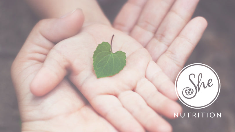
The S cradles a heart shaped leaf symbolic of the heart centred support you will receive when engaging with She Nutrition. The leaf is also symbolic of growth and natural health. Handwritten font communicates friendliness and personalization and contrasts with sophisticated modern sans serif font. The circle represents the holistic approach to Nutrition and health.
See the website